Several sites,one platform.
Possums helps exhausted parents and the clinicians who support them. The knowledge was excellent; finding it was not. Marketing made the call to bring several separate sites under one domain, for SEO and a single brand; the team rebuilt them as one platform serving both audiences. I have worked on the front end throughout, and I am building the professional side now as NDC Institute moves across.
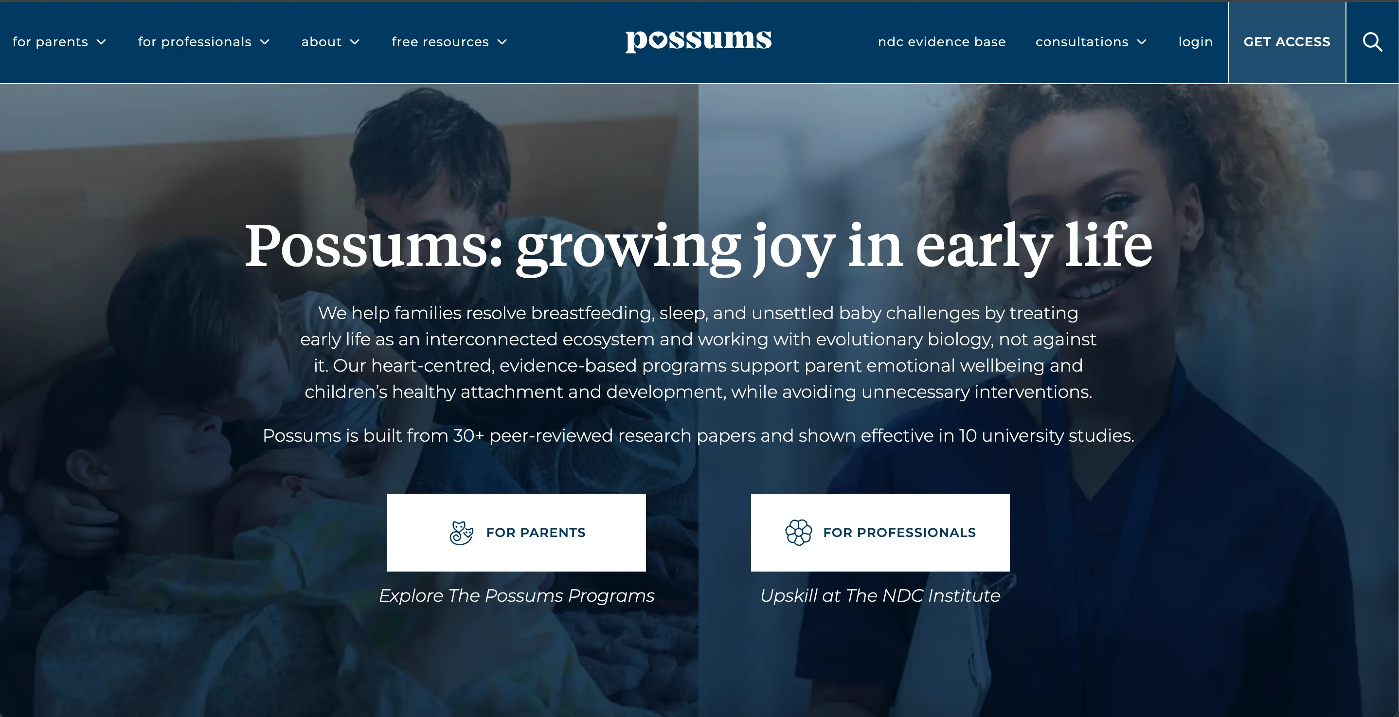
01 — The problem
The content lived across several separate websites, each with its own navigation, styling and login. A parent at 3am looking for help with an unsettled baby had to guess which site held the answer. A clinician looking for training had the same problem in reverse.
Two very different audiences were being served by one voice, and neither journey was clear. Maintaining separate codebases also meant every change had to be made, and tested, several times over.
The real constraint
The users are sleep-deprived. Every extra click, every ambiguous label, every slow page is a person giving up on help they need.
02 — My role
Fullstack developer, working alongside the design and product teams. Most of my work is on the front end, but a fair amount sits behind it: NestJS endpoints, Prisma schema changes, GraphQL, and data migrations against live records.
Front-end architecture and shared components
Full-stack features from API to interface
SQL → PostgreSQL migration and schema design
Performance, SEO and accessibility work
Problems I found and fixed
03 — bugs I caught, and what I changedProduct direction came from the team and the architecture calls from my lead. These are problems I found in the code and the fixes I shipped.
01
Draft articles were publicly readable
The blog listing queried articles without filtering on publish state, so anything saved as a draft was reachable by anyone who found the URL. I added the constraint at the query level in the article service rather than filtering in the component, so it holds everywhere that service is called.
02
Sign-ins failed on capitalisation
Anyone who registered with a capitalised email could not log back in with the lowercase version, because the lookup compared the stored string exactly. Fixing it properly took three changes rather than one: a case-insensitive lookup so existing accounts could sign in, normalisation on write so new ones are stored consistently, and an admin-only migration endpoint to clean up the rows already in the database.
03
The page stopped scrolling
The article Progress Tracker locked body scroll while its sidebar was open, but never removed the class when the component unmounted. Navigating away left the whole page unscrollable. I added the cleanup to the effect and reset the sidebar state with it.
04
The carousel could never reach its last card
The guest speaker carousel tracked its position with a round of scrollLeft divided by the track width. Cards are sized as a percentage of that track, so the estimate drifts further out with every item, and the last card's left edge never reaches the viewport's, so it could not be selected at all. I measured position off the items themselves, special-cased the end of the scroll, and moved the whole thing into the shared carousel hook, which took 68 lines out of the component. While I was there I hid the dots and arrows when there is nothing to scroll, using a ResizeObserver so it stays correct as the layout changes.
04 — How it’s built
- Front end
- Next.js · TypeScript · Sass modules
- API
- NestJS · GraphQL
- Data
- PostgreSQL via Prisma
- Content
- Editor-managed pages, resources and courses
- Search
- Meilisearch, indexed from the article service
- Quality
- Semantic HTML, keyboard paths, Lighthouse budgets
05 — Accessibility
Health information has to reach everyone, including a parent one-handed on a phone in a dark room. Treated as a requirement, not a polish pass.
- Semantics first
- Real headings, landmarks and lists, so screen readers and skim-readers get the same structure.
- Keyboard paths
- Every interactive element reachable and visibly focused, with no mouse-only journeys.
- Contrast & type
- Readable sizes and contrast held to WCAG AA, checked in the component library rather than per page.
- One-handed use
- Mobile-first layouts and generous tap targets, for the parent holding a baby in the other arm.
06 — What I’d do next
Audio is moving onto the site. A lot of Possums is meant to be listened to rather than read, by someone who cannot be looking at a screen, and it currently lives elsewhere. Hosting it ourselves makes the player, the storage and the progress tracking all ours to build.
The other piece is making Possums installable. A progressive web app is the sensible route: one codebase rather than two native builds, and it answers the audio problem at the same time, because a service worker can cache episodes for offline listening. That matters for this audience specifically. A parent settling a baby at 3am is not reliably on wifi.